Everyone eats with their eyes first.
Before a reservation is made, before a delivery arrives, before a bottle is pulled from the shelf — someone looked at an image and decided. remastr.studio gives every dish, every product, and every bottle the visual standard that makes that decision easy. You may be a brilliant chef. You do not have to be a brilliant photographer as well.
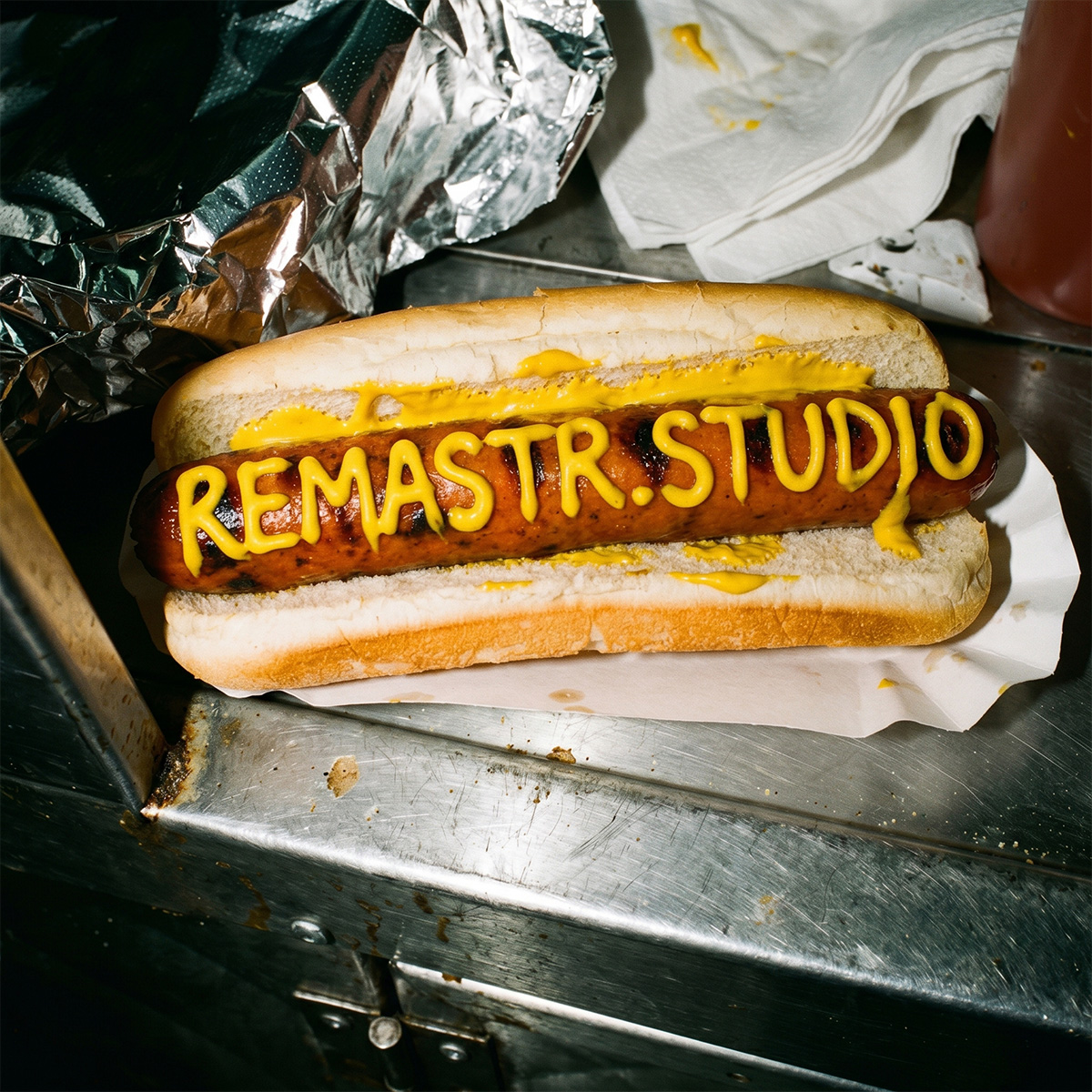
The food industry has always understood that presentation matters. What has changed is where presentation begins — and how high the standard has been set. A diner researching restaurants on their phone is looking at photography produced by teams with serious budgets and serious equipment. A customer on a delivery platform is making a decision in under a second, based entirely on a single thumbnail. A wine buyer on a merchant website is selecting a bottle they cannot open, smell, or taste. In each case, the photograph is not supporting the sale — it is the sale. And for most of the businesses competing in these spaces, their photography is not doing that job.
The menu that makes the booking.
Before a diner walks through the door, they have already made a judgement. It happens on Google, on Tripadvisor, on the restaurant's own website — wherever they land when they are deciding where to eat. The food photography they encounter in those moments is setting expectations, communicating price positioning, and either creating appetite or extinguishing it. Premium restaurant groups spend considerable sums to ensure their photography does all three correctly. The rest of the market is competing against that standard with imagery that was shot on a phone between service, under kitchen strip lighting, by whoever happened to be holding the handset.
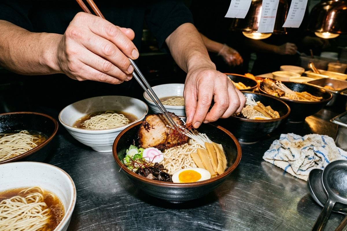
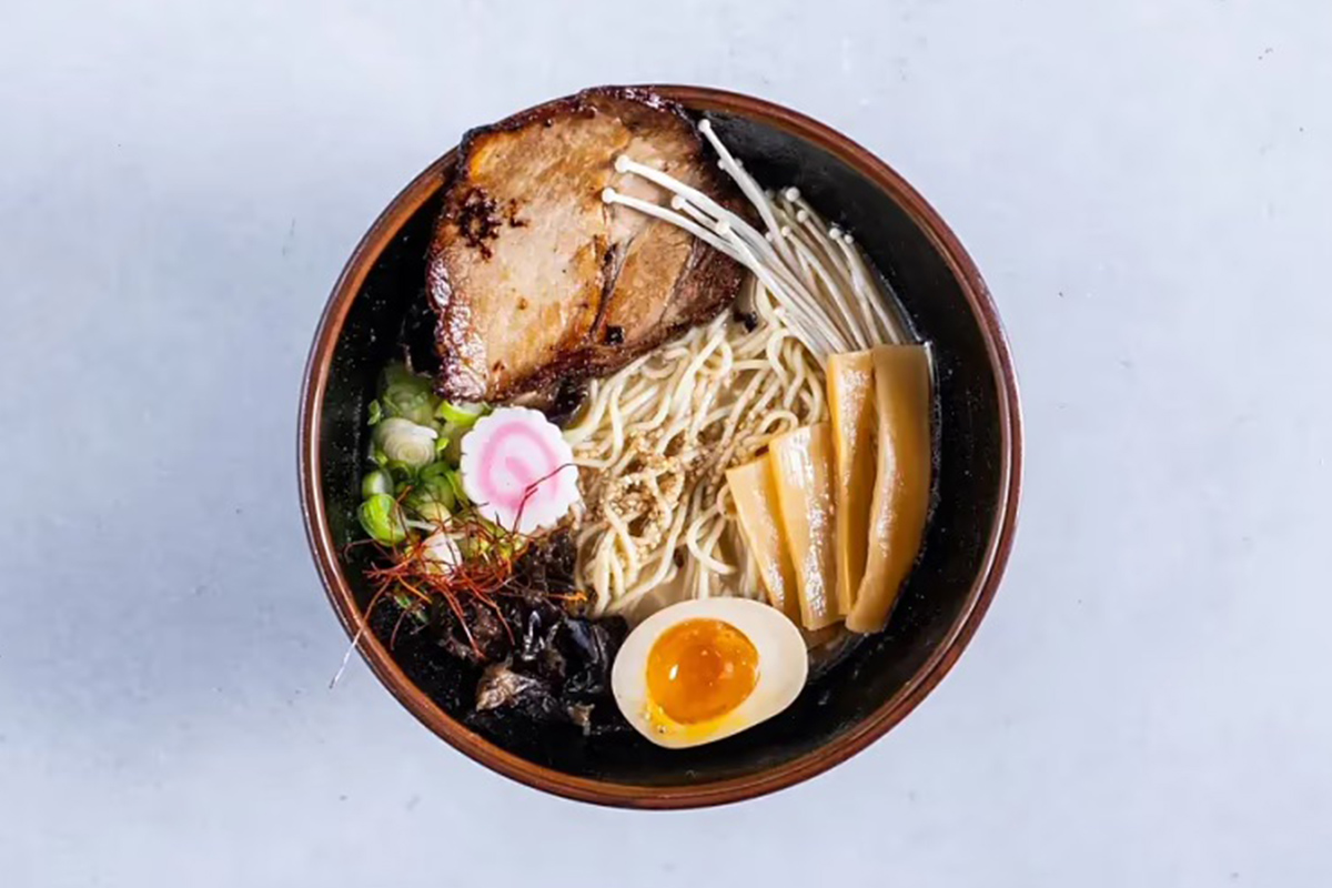
We work through entire menus systematically: starters, mains, desserts, drinks, specials, seasonal items. Every image is produced to a unified visual language calibrated for the restaurant's brand and positioning. A neighbourhood bistro and a fine-dining destination require different photographic treatments — different surface textures, different light quality, different compositional choices — but both require that every image on their menu reads as intentional, professional, and appetite-led. We deliver that standard across every item, however large the menu, and at a pace that keeps up with a kitchen that changes its offering with the seasons. And because food today sells a story as much as a dish, we produce lifestyle imagery alongside catalog work — turning real moments from a working kitchen into photographs that give a restaurant its character wherever it needs to show not just what it serves, but who is behind it.
The dish that stops the scroll.
On Wolt, Foodora, and every comparable delivery platform, the photograph is the entire sales experience. There is no smell, no ambience, no waiter describing the specials. There is one image, a price, and a button. The restaurants that convert best on these platforms are not always the ones with the best food — they are the ones whose photographs communicate quality, portion size, and appetite appeal in the half-second before a customer scrolls past. Most menus on delivery platforms look indistinguishable from each other. The food is different. The photography makes it look the same.
We develop a visual identity for each restaurant's delivery presence: a consistent approach to light, background, surface texture, and compositional framing that makes their listings immediately recognisable across any platform. Your burger does not look like every other burger on the platform. It looks like yours. That style is applied consistently across every item on the menu, so that a customer encounters not a single dish but an entire visual world — coherent, distinctive, and built around the character of the restaurant it represents. The food is presented honestly: the ingredients are what they are, the portion is what it is. What changes is the precision of the light and the care of the presentation. On a delivery platform, that difference is the margin between a restaurant at the top of its category and one that disappears into it.
The bottle that sells before it's opened.
Wine, spirits, and premium beverages are among the most technically demanding product categories to photograph. A bottle is a complex object: glass that refracts and reflects differently depending on the angle and quality of the light, a liquid whose colour and depth communicate quality before the cork is pulled, a label that carries the visual identity of the producer and must remain legible, accurate, and typographically precise in every image. Getting all of this right simultaneously — in a way that is commercially compelling, not merely technically correct — requires a level of control that most product photography cannot reliably achieve.
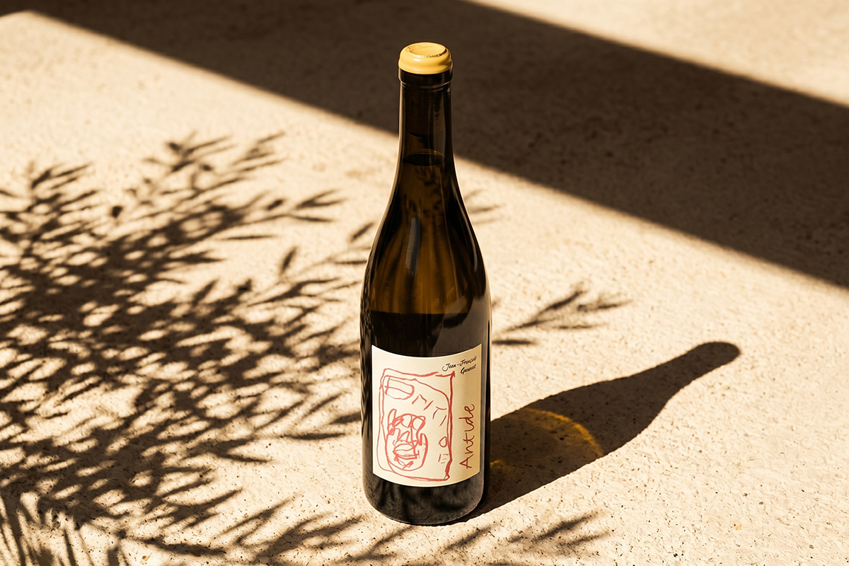
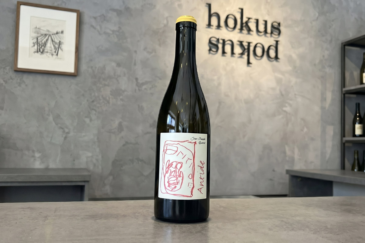
We work with wine producers, importers, spirits brands, and specialist retailers to produce imagery that represents the product with the accuracy and the atmosphere it deserves. Label fidelity is non-negotiable: every detail of the typography, the embossing, the colour treatment, and the surface finish is reproduced exactly as it appears on the physical label. The liquid is shown at its actual colour — the straw gold of a Burgundy white, the deep garnet of an aged Rioja, the amber depth of a twenty-year malt — with the refraction and luminosity that communicates quality to a buyer making a decision from a thumbnail on a wine merchant's website. The lifestyle context around the bottle is calibrated to the positioning of the producer. A natural wine from a small domaine in the Rhône requires a completely different atmosphere from a prestige Champagne house. Both require that every bottle looks as though the decision to buy it is self-evident.
We're here to help.
Send us a selection of your current menu or product images — whatever you have, however it was shot. We will show you what remastr.studio delivers in return. No commitment required.
Get in touch